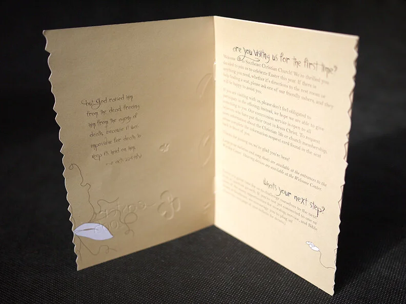
Preparing for Easter weekend has new challenges. In doing sketches, I made ea mockup booklet instead of the normal bulletin, with embossed matte paper and jagged edges. To give texture and feel to what is normally a slick hand out. Muted colors and hand drawn scribbles of flowers, symbolizing new grown but very organic and not refined.
Along with the church banner instead of printing two as normally done for easter and Good friday. I was able to save the budget create a detachable banner that can be removed for good friday.
Good Friday designs are dark, yet hand drawn as well, and Easter is the antithesis with light bright full of life colors. The colors intuitively speak to the tone of the event.


Easter (images below): All are welcome, a sign of welcome is wreath, and yet easter had a crown of thorns. I wanted to blend that idea with the supernatural.
The grey piece was for screens..


